Out of the Shadows: L. Ward’s Wordless Graphic Novels
By Pip Dickens/
I was introduced to the fascinating wordless graphic novels of Lynd Ward by chance. And I am forever grateful. One of the great things about being a compulsive collector is the buzz you get hunting down your quarry and getting it at the best price and condition possible. The rarer the book, the greater the buzz. It compensates for the sense of guilt you feel spending money on what can only be described as frivolity. It is the kind of excitement you feel embarking on a treasure hunt. I cannot resist a first edition, illustrated book. To be more precise a first edition, illustrated book signed by the author or illustrator. The more you search, the more you learn and it is through this process that I first encountered the work of Lynd Ward. Prior to this I had no idea who he was, and what a great influence he was on early pioneers of the graphic novel.
Ward was an American artist and illustrator known for introducing the wordless novel format to America, which is the forerunner to the graphic novel. In 1927 he studied in Leipzig, Germany at the National Academie of Graphic Arts and Bookmaking.Here he was strongly influenced by a general revival in medieval wood engraving techniques (as were many other artists including Kathe Kollwitz later in her career) and by his wood engraving tutor, Hans Alexander “Theodore” Mueller (remember this name as he pops up later). Whilst in Leipzig Ward also came across a copy of Flemish artist, Frans Masereel’s 1919 wordless novel The Sun. These three experiences underpin his distinctive style. Once you see a Lynd Ward wood engraving you never forget it.
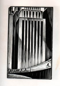
Ward returned to the United States the following year and began work on his first wordless novel, God’s Man, which was published by Jonathan Cape and Harrison Smith New York in 1929. The storyline is Faustian (so you know it isn’t going to end well). The plot: an artist signs away his soul in exchange for a magic paintbrush and this image of the last page of the book pretty much sums it up [spoiler alert].
Scanned final page from 1929 edition of God’s Man by Lynd Ward, Copyright Pip Dickens
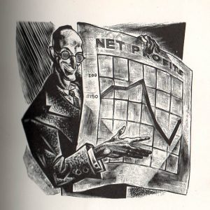
The timing of this dark and mysterious series of wood engravings couldn’t be more profound given that 1929 was the year of the Wall Street crash, triggering the Great Depression in industrialised nations that would last over a decade. When ‘reading’ Ward’s wordless novels within this context it becomes apparent that clues are being woven into the pictures about poverty, greed, disaster, politics, dreams, escapism and regret. This dark thematic approach chimes with Masereel’s wordless novels where aspects of social injustice are graphically expressed. What makes these illustrations compatible with the themes is due to the selection of process, namely, wood engraving. The lines are clean, the black ink heavily saturated and the cutting methodology accentuates harsh distinctions between light and darkness. Ward combined this mastery of technique with the kind of exaggerated perspective that was adopted by the subsequent graphic novel genre. I also believe it is reminiscent of the darkly atmospheric films being made in Germany in the 20s and 30s such as Robert Wiene’s The Cabinet of Dr Caligari, Murnau’s Nosferatu and Faust and Fritz Lang’s Metropolis and M. I like to imagine Ward experienced some of the early German Expressionist films during his time studying in Leipzig but have no evidence.
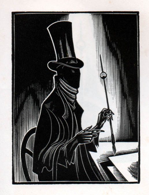
Scanned pages from limited edition copy of God’s Man by Lynd Ward, Copyright Pip Dickens
Ward’s wordless novels align with the genre of film perfectly. As you turn each page you encounter a single image (sans words) not unlike a film cell. These individually contained images may make sense in isolated contemplation but once formed into a sequence, page by page, the ‘reader’ must get to grips with making contextual associations and figure out what is being expressed through continuity, in silence, with no written reference. The direction, as with film, is forward to a specific final image (frame).
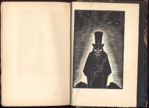
Scanned pages from limited edition copy of God’s Man by Lynd Ward, Copyright Pip Dickens
Book collecting involves detective work and it is through this process that new information is gleaned about Ward. I own two copies of Ward’s God’s Man. Both are precious but one of them is treasure. Both books were printed by Jonathan Cape and Harrison Smith New York. One in 1929, the other in 1930. It is the 1930 edition that is the treasure despite being printed a year later. The first edition was so popular that Cape and Smith decided to produce a celebration limited edition a year later. Ironically few original copies of these popular wordless novels exist making any early edition valuable. The 1930 edition has a hardback cover in simple black cloth weave and contains a pasted wood engraving print in the top right corner.
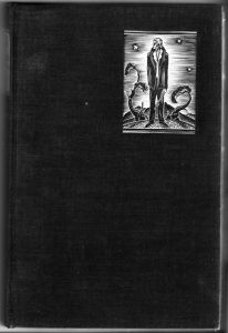
Scanned Front Cover of the 1930 limited edition copy of God’s Man by Lynd Ward, Copyright Pip Dickens
Inside the book, on the copyright page there is an original signature and it is Lynd Ward’s. This is one of the criteria fulfilled for the collection. The book is a limited edition, being No. 313 of 409 copies. As one handles the book, comparing it with the popular edition the differences are marked. The limited edition is a different size, has a different cover and, of course, is signed but what makes it truly remarkable is that each page is a print from Ward’s original woodblocks. That’s 144 pages of individual prints. Over time oil from the ink has transferred slightly ghosting the opposite blank pages but the prints are rich. In contrast, the popular edition was printed using electrotype plates made from the blocks. There is, therefore, a big difference in visual quality. Looking at the book from the top, the pages are gilt edged and the open sides are deckled edged.
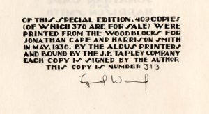
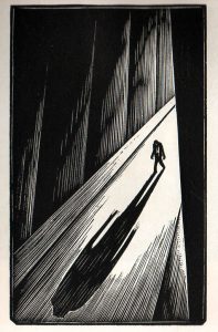
Scanned page the 1930 limited edition copy of God’s Man by Lynd Ward, Copyright Pip Dickens
Through further scrutiny other clues reveal themselves. The dedication in this, Ward’s first book, is to his wood engraving tutor ‘Theodore Mueller’(remember him?) and two others being John Heins and Albert Heckman. Could this be the American painter and lithographer Albert Heckman (1893-1971)? It’s possible, the timeframe works, and he also studied in Leipzig at the Academy in 1929, two years after Ward did. The artist John Heins (1896-1969) was also active during the same period, in New York, producing wood engravings. It’s plausible. I have a letter Ward wrote to a fan on his headed paper in November 1930 and the address is 1132 Abbott Boulevard, Palisade, New Jersey. All three artists were working in the New York area around this time.
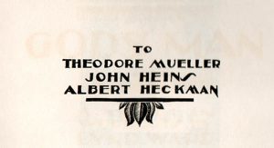
Scanned dedication page from the 1930 limited edition copy of God’s Man by Lynd Ward, Copyright Pip Dickens
The limited edition also contains a second Lynd Ward signature, this time accompanied by a note. As a collector this is very exciting because within this singular copy there is a unique communication.
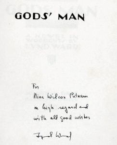
Scanned title page from the 1930 limited edition copy of God’s Man by Lynd Ward, Copyright Pip Dickens
So, who is Nina Wilcox Putnam? Putnam was a prolific writer, playwright and screenwriter based in New York, Hollywood and Florida. She had some 12 films made from her writing, the most famous being her novel ‘Cagliostro’ which she adapted for film with Richard Schayer to become the The Mummy (1932) starring Boris Karloff. She also had a comic strip called Witty Kitty. So much information has been revealed and just from one specific copy of a book! Over the years I have expanded my Lynd Ward wordless novel collection to include Mad Man’s Drum, Song Without Words, and Vertigo. I added to this other illustrative work he did for books using words including Mary Shelley’s Frankenstein published in 1934 by Harrison Smith and Robert Haas, New York. However, it is his wordless novels that are his most significant contribution to literature and illustration, and of course the genre of graphic novels. In Ward’s final wordless novel, Vertigo (1937), he presents three characters: a young female violinist, her fiancé and a business magnate against the backdrop of a turbulent downward spiralling American economy.
Scanned page from the 1937 edition of Vertigo by Lynd Ward, Copyright Pip Dickens
Some of the illustrations depict roller coasters, carousels, trains and cars (speed) and there is a general sense of things spinning wildly out of control. Ward breaks up the action with interventional pages blank except for a year. These interventions appear at irregular intervals starting with 1929 (the year of the Wall Street crash again) and ending with 1935 after which years are replaced my months which appear with greater frequency and these, in turn are replaced with increasing frequency by the days of the week concluding, on the penultimate page of the book with the word ‘Sunday’. The final page depicts a couple holding on for dear life to one another as the roller coaster hurtles downward into darkness. There seems to be something strongly filmic about the way Ward is working. I feel he has anticipated what would become a popular film genre suspense tool, that of the ‘ticking clock’ or countdown to disaster.
Vertigo can be interpreted as a canned history of America fixed on a downward trajectory. Recent comparisons being made in the media with 1930s austerity juxtaposed with the new presidential era of Trump makes me look again through these pages …are the pictures telling a new yet familiar story? Just think of Tan’s “The Arrival” which can trigger deep thoughts on emigration and refugees. This is the intrigue of a wordless novel. It is open to re-interpretation dependent on the state of the ‘reader’ in a certain context, at a certain time.
It is a privilege to own these books. The physical, sensory…The detecting of information these books evidence has played a major role in revealing more to me about Lynd Ward and the people he interacted with. Books such as these are history. How they were drawn, printed, bound, decorated, who owned them, who wrote in them reveal all kinds of fascinating information and as such are truly unique historical and cultural artefacts.
Pip Dickens is an artist and a Lecturer in Fine Art, Lancaster Institute of Contemporary Arts
Lancaster University link: http://www.lancaster.ac.uk/lica/about-us/people/pip-dickens
Paintings: http://www.pip-dickens.com
