demo: https://dashboard.christianremy.com/
github: https://github.com/ChristianAoC/energy-dashboard/
Energy management in corporate settings and public organisations is a complex subject that involves gathering, analysing, and interpreting vast amounts of energy data. Making such data accessible enables stakeholders to discuss potential savings, identify waste in consumption, and highlight opportunities for interventions.
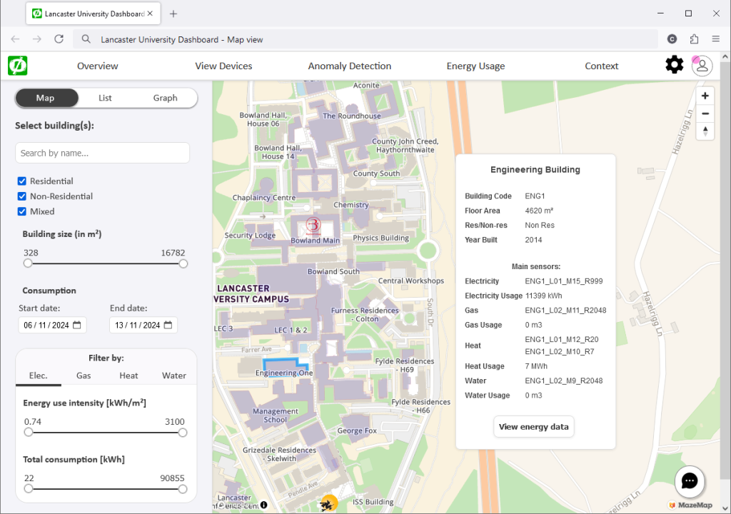
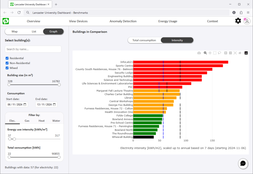
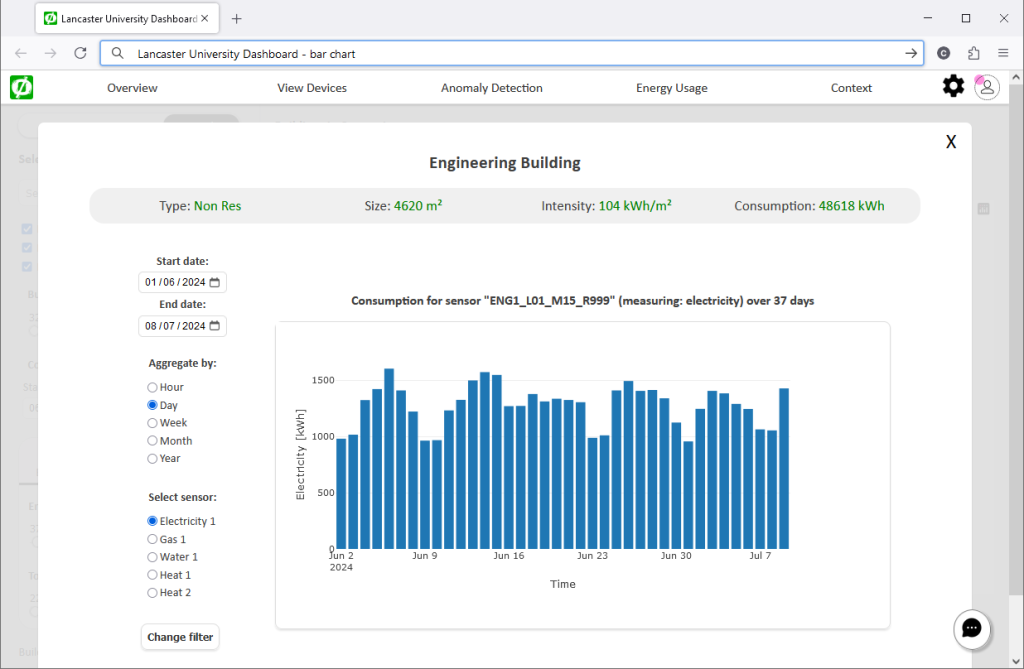
As part of the Net0i Project, we developed an interactive dashboard that takes historical energy data and displays it in different formats. Users can compare buildings with each other as well as to established industry benchmarks, search for information about specific buildings or sources of energy data readings, and see times of consumption considered not normal, i.e., particularly high, low, or simply not following expected patterns (so called “anomalies”).
Another important functionality is the ability to add comments to a data series, to add what we call “context”. Context enables us to explain why and whenever values are raising eyebrows; for example, a unique event that resulted in higher-than-expected energy usage for a certain period in a specific building, or an intervention by the facility manager to save energy. Such context makes it easier for inhabitants of the space to understand the sea of data, while it allows for energy managers to annotate and communicate their findings.


